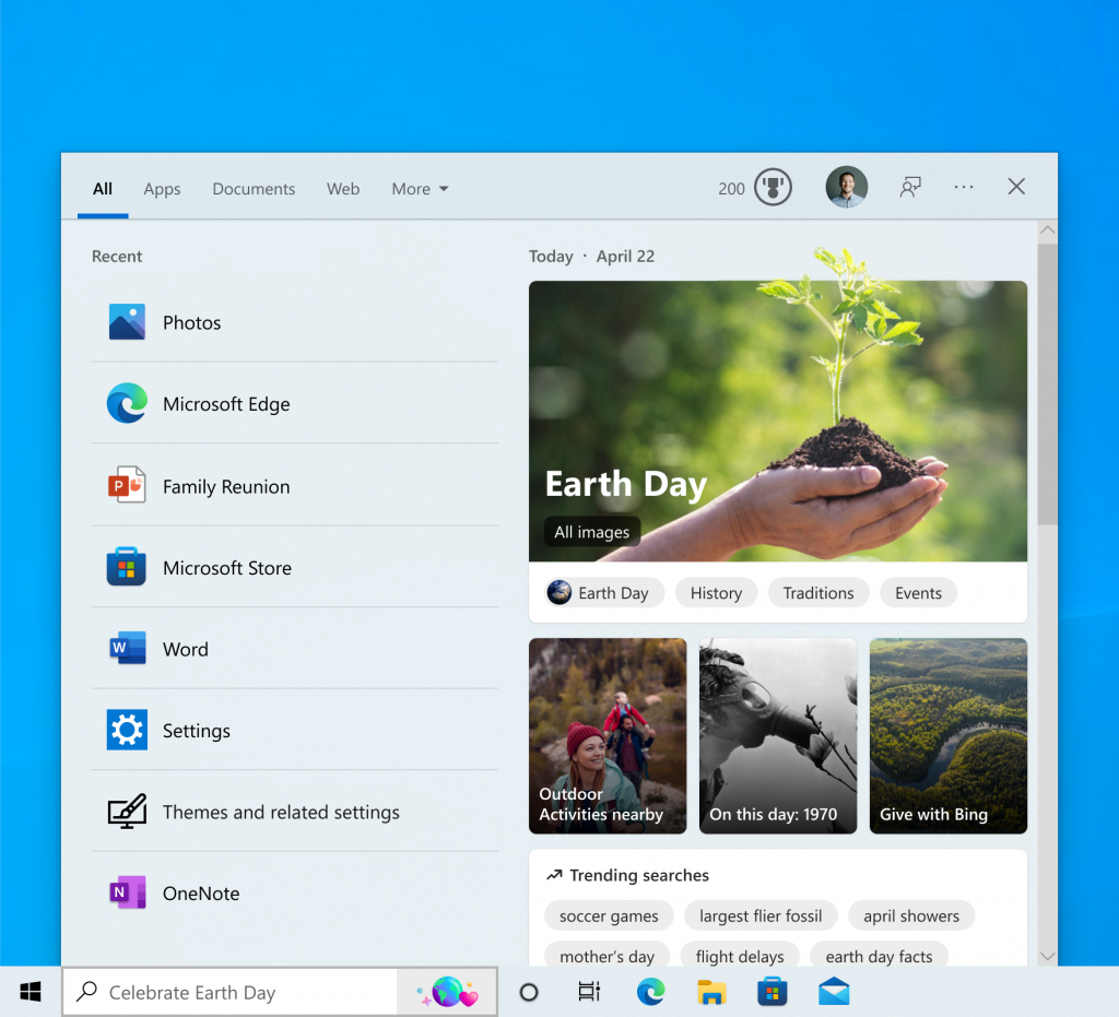
 [German]It seem that Microsoft is running another A/B test with Windows 10 users. I got reports from German users, who are suddenly facing new icons within the task bar's search box. It's obviously the back port of search highlights, Microsoft has announced for Windows 11 and Windows 10 recently with an Insider Preview. Here's what I found out, after a blog reader send me an email.
German blog reader Werner P. contacted me via email and brought an issue to my attention, that I have not encountered before.
New Search Highlights icons in Windows 10 search box
The user contacted me because he suddenly gets new icons like a triangle, a pencil and an olive branch (I'll just call it that) displayed in the search box in the Windows 10 taskbar. In his first email he wrote:
New icon next to search box in Windows
Hello Mr. Born,
I have a new icon next to or rather in the search bar of Windows 10 since today:
None of my colleagues have seen it yet….
Do you know what this is all about?

The arrow in the above screenshot points to the newly appeared icons. I myself didn't realize at first quick glance that it's not a notification in the taskbar status area (I would have guessed application icons). But since the icons are displayed in the search box, it must have some other meaning (now it's clear, it has something to do with search highlight).
Is Microsoft running an A/B test with search?
My guess was that Microsoft is testing a new functionality (a back port from Windows 11 search) and is running an A/B test with selected users. The reader (who contacted me) can't really make sense of these icons and their functionality and I really didn't a clue. A short search on the Internet initially didn't really brought me any further. But Werner wrote the following in a second mail:
It has to do with that:

But the colleagues do not have the choice at all
The context menu entry marked with a red arrow says Show search highlights. This option may be used to hide the icons or show them again.
Microsoft's Search Highlights
And then I got it with the context menu command mentioned above. There is a similar option for search under Windows 11 – and Microsoft announced the backport to Windows 10 – Windows Insiders were able to test this with Windows 10 version 21H2 starting with build 19044.1618. Microsoft described the whole thing as "Search Highlights" on the Windows blog. A screenshot with similar icons can be found there.

Microsoft describes in this Techcommunity post how to configure the Search Highlights in the search box using group policies. At winaero.com, registry entries to disable them are also described.
Other references
In a third e-mail Werner posted me this reference in the German Microsoft Answers forum, which he came across. There, a Windows 10 user posted the following text on April 26, 2022.
Icons in the Windows search bar
Hello,
where do these icons come from and how can they be disabled?

The icons can be hidden with a right click and the context menu command Show search highlights (see context menu above). Now the open question remains: Who else has these icons in their Windows 10 search box?
Addendum: I've found now two additional sources at the English Microsoft Answers forum, where the feature has been mentioned:
Search Highlights !!
How to turn off search highlights in Windows 10?
There are also screenshots of the new (different) icons.

Feature is gone after hours
Addendum:We are now one day older – and Werner has now followed up with the fourth email.
the whole thing is strange – today the icon disappeared again – but the settings are unchanged ????
On a Windows 11 computer I just looked for interest:

Here I find but (at least on the quick) in the options no more option to show a search bar.
Well, easy come, easy go – and the user can't do anything about it. Because this functionality is enabled or disabled by Microsoft on the server side. This is also the reason why bugs in the search cannot be fixed by a rollback in the Windows client.
My 2 cents
Ok, I have now slept a night over the above facts and would like to deliver my 2 cents as a follow-up. This episode is a classic example of a super-fail on Microsoft's part. The developers are working on their code for months, because we have "as-a-service" and the kids in Redmond are very proud of it. They test it – with randomly selected testers. It's also announced somehow in some article on the Windows blog, where news from Insider Preview builds is presented.
And then the feature comes, but nobody knows what to do with it. You would have to be one of the 1-2% of Insider Preview testers who follow what Microsoft releases from its development labs on a daily basis, read and understand all blog posts in the Windows blog, and finally test the stuff – every week – to stay up-to-date.
99.9% of Windows users can't and won't do that. I remember a saying of my boss in the 90s, who always admonished me not to lose sight of the core marketing message in software development: "A product must be important, perceptible and durable for the customer, so that it can be successful".
Ergo: The Microsoft people are missing the point. The new features are obviously not really noticeable (for the masses, anyway). Whether they are important, we will see – I have doubts. And permanently? What is permanent with Windows since 2015? New bugs, removed features and heavy update collateral damage. But whether that is to be seen as a product advantage?
See my follow up article Windows 10: Microsoft expands "search highlights" in search area (May 19, 2022).


Just got this ridiculous UX/UI un-enchancement.
M$ doing more stupid things without user permission.
Thank you/Danke for posting info here!!!!
I agree 100%. Props to the mod (GBorn) at MS Community who informed us about this useless, tacky and unwanted/unasked for "feature".
Well, it's a kind of "sitting between all chairs" – I'been rather active for more than a decade as MS answers community moderator (they call it now volunteers, it's an nonpaid activity) – but since Win 10 I've withdrawed more and more, because things went downhill.
Now I'm still active in my community moderator role (until it's getting cut) to report bugs (brought to my knowledge by my blog readers or others, and that has been verified or summed up by an English blog post here within my blog – it's the best to let Microsofts developers know whats going on). It works in most cases, but my critical reports about such issues – and useless features – are (possible) a reason, why the Insider MVP has been gone some years ago (although this award is no more worth of for me, because that thing has also going downhill – compared to the MVP award, granted to people engaged in Windows consumer untill 2015 – I won't be the marketing mouthpiece for MS).
So my engagement in this matter is fading away – Linux is also a nice platform. And I'm still blogging here for my reader community – not for Microsoft.
I was going crazy trying to figure out how to disable this new unwanted "feature". Thanks (Windows 10 x64 Pro)
I got it too. Today my icons were a butchers knife and a hunk of meat. If I was a vegetarian, or suffering knife-related PTSD, I might take offense.
Thanks for telling how to get rid of it
thought i'd ticked and unticked everything, must've missed it somehow, thanks for helping get rid of that rubbish
I'm in Australia and this popped up a few days ago. I hate anything that is unnecessary on what is already a cluttered interface so was going crazy trying to find out how to turn it off. The right-click tip worked for me – THANK YOU! Now just got to figure out how to stop web searches in that search bar instead of only finding stuff on my computer.
Thanks for the information I needed to get rid of this unwanted garnish.
Thanks for the tip. It's one thing when it's just annoying icons I can ignore, but when they start shoving June Pride Month down my throat, that's too much. I get more than enough of that at my super-liberal workplace.
Windows es una vergüenza que abusa de su posición de cuasi monopolio, como un vulgar matón de western.Ahora en una simple ctualización sin pedir permiso a nadie, me mete un icono de inicio con un dibujito en la barra de tareas. A ver si os váis a la quiebra de una vez. Y dejad de insistir con el Edge, el maldito Bing, Onedrive y 365. y..y..y….
Dáis ascooooooooooooo, ¿para cuando el definitivo magnífico windows para toda la vida que siempre anunciais?